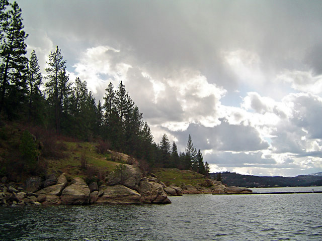
It felt SO good to get out of my regional area because I felt like I was in a little bit of a slump. It was refreshing to head up North to get away and recouperate. There is minimal amounts of post-processsing here, and they are as follows:
1. Cloned out small weird thing in clouds
2. Shadow and Highlights (Land was a bit dark)
3. Added Saturation
4. Little NeatImage
5. Re-size
Statistics
Place: 93 out of 147 Avg (all users): 5.3539 Avg (commenters): 5.6364 Avg (participants): 5.2093 Avg (non-participants): 5.4891 Views since voting: 1036 Votes: 178 Comments: 12 Favorites: 0
Beautiful spot and day for photography. You have all the elements needed for a great image. You have a dramatic sky, body of water, trees and rocks on a hill! This image has a lot of potential. What it is in need of is a dramatic feel. I see that you adjusted for shadows and hue, but I think you could have gone a little farther in your post processing. I think firstly, your horizon is slightly tilted to the left, this is a quick fix and help your viewer get the proper sense of perspective. I think you may have taken away too much shadow on the hill. You've left it kind of flat and lifeless. Shadows create drama, they draw the viewer in as they look at all the shapes and textures shadows bring out. Another tool to get familiar with is the burn tool. This tool is very effective on clouds. You can make these nice fluffy grey clouds to appear to almost be bursting with rain with some good burning. Burning will increase the dramatic feel and depth of these clouds. You can also do some light burning on the water too, again it increases the interest in the shot. A trick taught to me is to do some burning around the edges of the shot to help the viewer get drawn into the image, it helps take away the distractions often found at the edge and brings us right into the main focus of the image.
I would like to see this shot modified with burning and dodging, I think you'd have something that would look great hung on the wall.
(I'm writing this to everyone who submitted a landscape shot) The challenge was to produce a shot worthy of a magazine cover but to me a shot like this is not suitable to be put on a "portrait" format magazine.
Beautiful sky though
---ADDITIONAL---
Due to forum discussions and accusations that marking landscapes down is nitpicking, I'm going through them and remarking. I still think some of the landscapes would not make good covers because of their orientation but I am no longer marking down because of that.
I still think landscape is inapropriate for the majority of magazines but I'll give the benefit of the doubt to the photographers.
Wow! This is an awesome shot. This is top quality and pitch perfect. I'm going to give you a high mark; however, you may find others will mark you down for having a horizontally cropped image instead of a vertically cropped image. IT seemed to be an issue in the last magazine challenge.






 Add photograph to your favorites
 Add photographer to your favorites

 Photographer found comment helpful.


