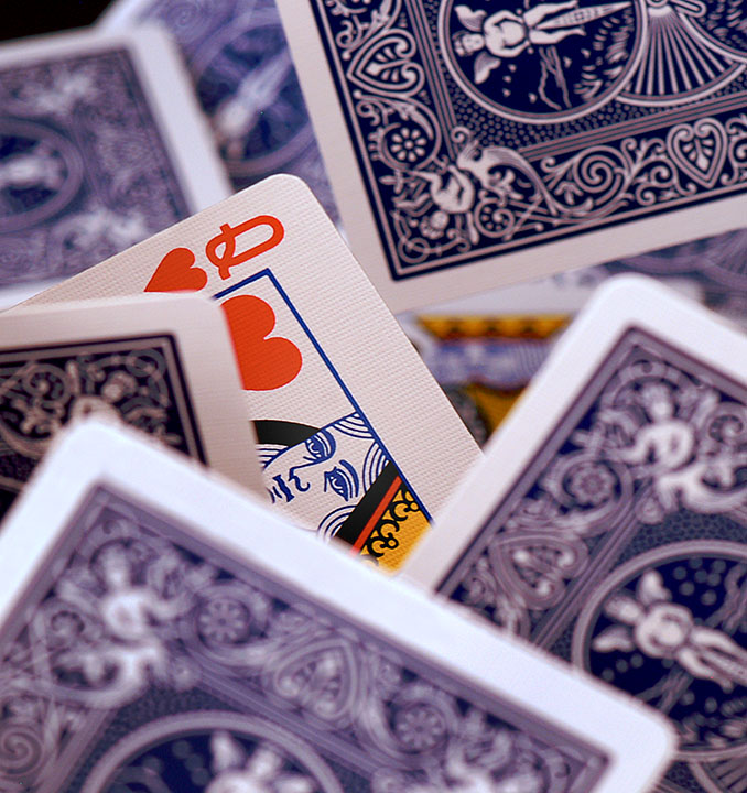
Really neat idea. The only thing that I don't like so much about it is that the cards in front seem just a bit too blurry to me; Kind of hurt my eyes to look at. But otherwise I love it; Very creative.
Interesting use of DOF. Personally, I would have changed two things; only have the one card face up, and cover more of the queen, leaving just the eyes. Those recommendations are just for the sake of the theme, not on the photo itself.
I like the closeness of this shot. You can see the texture of the cards and it looks like the cards are separated slightly, not all stacked up in a pile...that adds nice dimension.






 Add photograph to your favorites
 Add photographer to your favorites


 Photographer found comment helpful.


