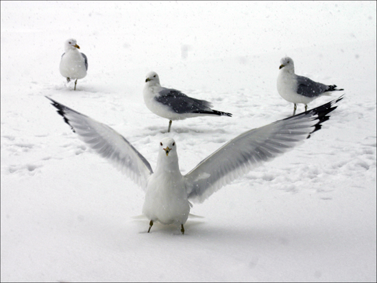
Very nice shot, I really like the bird in the foreground. The composition of the birds in the background doesn't quite do it for me, especially the one that almost looks like it's resting on the main bird's head but I realise that a better opportunity may not have existed. There are some great textures in the snow caused by their footprints. It's a shame about the gunk on the lens.
This is a really nice picture. I like all the whiteness and the way the front bird looks like it's protecting the others. However, I don't think these birds would end up on the cover of OP. Not that it will change your score, you just picked the wrong mag to represent the picture. I subscribe to OP.
First thing I notice is the landscape orientation, but I'm sure a magazine layout editor could do something with it. Seems a tad underexposed, which is very easy to do with a white subject on snow, and also could do with a little more sharpening.
(I'm writing this to everyone who submitted a landscape shot) The challenge was to produce a shot worthy of a magazine cover but to me a shot like this is not suitable to be put on a "portrait" format magazine.
---ADDITIONAL---
Due to forum discussions and accusations that marking landscapes down is nitpicking, I'm going through them and remarking. I still think some of the landscapes would not make good covers because of their orientation but I am no longer marking down because of that.
I still think landscape is inapropriate for the majority of magazines but I'll give the benefit of the doubt to the photographers.
LOL. A bubble caption reading, "You want a piece of me" would fit perfectly here. It looks like that bird is picking a fight with you. The only thing I would change would be to adhust your settings to bring out more texture in the snow. It is hard to do but I have seen it done. Just don't ask me how. Haven't figured it out myself.






 Add photograph to your favorites
 Add photographer to your favorites


