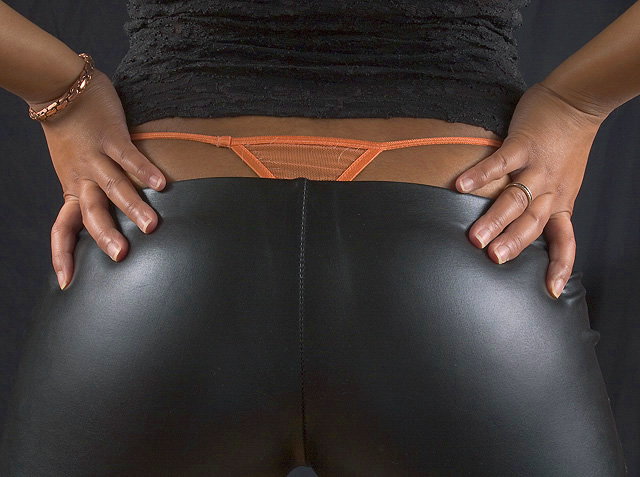
Challenge:Orange (Basic Editing I) Camera:Canon EOS-10D Location: My living room Date: Mar 18, 2004 Aperture: 16 ISO: 100 Shutter: 1/125 Galleries:Fashion, Studio Date Uploaded: Mar 20, 2004
My lovely girlfriend posed tirelessly for this shot.
I wanted to have a failry duotone shot with the orange thong, orangish skintones and black everything else.
Had I been able to spot edit this the only thing that would have been orange would be the thong. I would have also lightened the background between her legs so that you could tell she was wearing pants. I will be posting the spot edited shot in the individual photograph critique forum.
Statistics
Place: 167 out of 383 Avg (all users): 5.0867 Avg (commenters): 6.8947 Avg (participants): 5.0407 Avg (non-participants): 5.1484 Views since voting: 2423 Votes: 300 Comments: 21 Favorites: 5 (view)
YAY! 71 people thought it was a 7-10! Thanks guys. I knew when I shot it that I would give it a 5 or 6 myself so I am not disappointed in the least. I tossed it up here to get the ball rolling. Looking forward to fine tuning and doing more. Thanks for all the great feedback.
Great shot! I particularly like how the dual light source provides a symmetry to the shot. The bracelet, thong, and the fact that the shirt exposes the waist tell us about the woman in this shot and who she might be. The black background helps to keep the focus in the middle of the shot, but it might have been interesting to lighten it up a bit so we could make out her curves. Still, I really like this shot, technically. It's a 10 in my book.
Provocative - both by subject and by challenging the challenge (by just putting a small piece of orange color). But I totally get it. Maybe a little bit of saturation would have worked more.
Despite having very little orange in the photo, you made it stand out by properly contrasting it with the rest of the photo. However, had the orange been more vibrant, it would have really stood out with more impact.
Oh, My... Sometimes you can do so much with so little. :) This shot is great because of it's high technical photographic quality, but also because you were able in include only a tiny amount of orange yet meet the challenge spectacularly. Kudos to you!
I'd like to see more of the orange in this! Although orange is not the major color in this picture, it certainly is the primary one in terms of how the viewer's attention is directed.





 Add photograph to your favorites
 Add photographer to your favorites


 Photographer found comment helpful.


