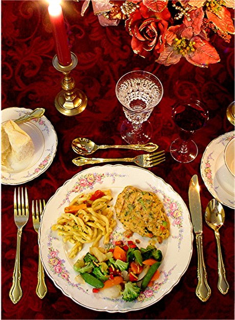
THe procade table clothe is very nice but is not suited to your table setting and the I think the meal on the main plate and the food on it are much to busy for a really pleasing to the eye effect.....TOOO many colors and the food does look all that well focused all though you should get brownie points for a well balanced meal. Love, Martha (well I got to do something while waiting to go to the big house! LOL!)
Very pretty shot, and it fits the vertical magazine format. If I were the cover editor, though, I be hard pressed to figure out where to put my type without detracting from the picture.
Your picture is really nice, the composition is great and so are the colors. I think it would be a bit better if the focus was crisper. I'm also not really sure that the flowers up in the corner really add to the shot. They kind of look like they are hanging in mid air.
very interesting. The food on the plate (which would be the primary focus of the magazine) lacks a little crispness in focus and (if I may be so bold) looks unappetising.
oh, what lovely china and flatware..the food looks delicious. The dinner is well positioned. I wonder if a plain colored cloth wouldn't look better. I find your cloth too busy and it competes with the flowers and the wine.,6
Elegant. Red makes everything look so rich. I like the styling and the pov. It looks like the food in oof, but maybe it's because you had to resize the picture. The only thing about the set up that I would change are the flowers. The whole setting would have been more "real" with real flowers. There are a couple of technical problems but altogether, a nice entry.






 Add photograph to your favorites
 Add photographer to your favorites


 Photographer found comment helpful.


