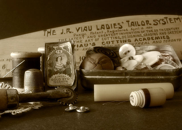
I enjoy 'antiques', especially in photos. The sepia toning you chose works nicely here.
This particular composition has some opportunities. This one looks rather 'linear'. Maybe some amount of 'chaos' in the order of the items in the photo would create a strong image as well. A higher camera angle would also possibly work well here. Maybe raising the camera up a few inches and turning it counter-clockwise would upset the horizontal composition enough to make something else interesting :)
Very appropiate subject matter and it has the right tone. The magazine is a verticle format so unlike many of the other photos with a horizontal photo, your's could be used!
(I'm writing this to everyone who submitted a landscape shot) The challenge was to produce a shot worthy of a magazine cover but to me a shot like this is not suitable to be put on a "portrait" format magazine.
Nice still life arrangement though
---ADDITIONAL---
Due to forum discussions and accusations that marking landscapes down is nitpicking, I'm going through them and remarking. I still think some of the landscapes would not make good covers because of their orientation but I am no longer marking down because of that.
I still think landscape is inapropriate for the majority of magazines but I'll give the benefit of the doubt to the photographers.
Very nice tones and subject. I would have liked a different composition for a magazine cover. Horizontal can be used, but I think most folks can envision a "cover" better by using a portrait layout.
I think technically, this is very nice with the lighting and focus.







 Add photograph to your favorites
 Add photographer to your favorites

 Photographer found comment helpful.


