This is nice too, but I think my preference would be the clean, crisp pure black and white one. There's something dramatic about the sharp contrasts of black and white in that one. But this one does have a nice touch of glam :)
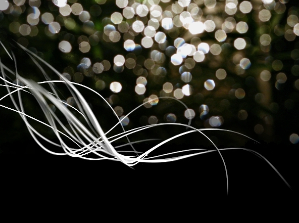
I almost thought it was a light painting from the thumbnail. Jutilda's overlay works nicely here, though I can see it extending a bit (and darker) below as well, maybe. A nice juxtaposition of shape and flow.
The image is really nice, I like the added bokeh, but I can't make up my mind if maybe it should be a little less pronounced. I think it may be over powering the palm spear.
The abstract quality of this shot is great. I feel the added texture is great and makes this a more interesting than the version without. It does have a feeling of the white palm holding the light from falling to the ground, nice!






 Add photograph to your favorites
 Add photographer to your favorites


 Photographer found comment helpful.


