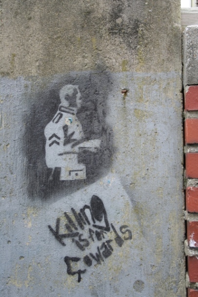
Let me begin by saying that I do not believe the military to be cowards. I am in the Marine Corps myself, along with my wife, and this is simply something I took a picture of. So please all my military brethren, please do not take offense to the picture at hand. I named the picture "Cowards" because of the people who have no right to hate on the troops. We joined to do some good and it turns out our orders were not what we wanted exactly.
Statistics
Place: 109 out of 127 Avg (all users): 4.6239 Avg (commenters): 3.6667 Avg (participants): 4.1522 Avg (non-participants): 4.7394 Views since voting: 764 Views during voting: 369 Votes: 234 Comments: 10 Favorites: 0
I'm new to the photography field so I do appreciate the advice. Well, for those who lent some advice to the shot. I don't know who put the paint on the wall but I would consider that alone to be pollution. I can see the need for more brick, that would have looked better I think. Too much negative space at the top...yep I agree. I submitted this picture so that I could get some helpful hints as to how to better myself in the field. So again, for those of you who offered some constructive criticism I thank you.
Good message -- gotta love positive pollution. As for the composition, I think it would look better with a good portion of the top cropped off, and I'd like to see more of the brick wall on the right.
On it's own the picture seems almost too random [snapshot-ish].. but it has so much potential .. Firstly, I think, maybe going landscape would have been better.. The picture seems oddly composed because of that.. with the landscape you could have more of the nicely textured negative space.. We could have seen more of the brick wall which would lent more diversity.. Going black and white would have tied the different textures together while bringing them out and highlight the message on the wall more attractively..






 Add photograph to your favorites
 Add photographer to your favorites


