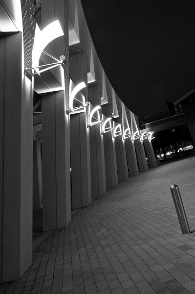
Taken during a trip down to the public library. In post, I brought the levels up slightly and added contrast. The B&W conversion was done using a 100% green filter then desaturation.
Post Challenge: Just a quick update. I noticed that many people didn't like the little pole. That was actually quite intentionally placed on my part. I liked how it stood is such opposition to the rest of the image both in orientation and texture. I think I could have more appropriately titled this one to give this impression to the viewer. Perhaps even called it "Standing in Opposition". But thanks for all the comments still.
Statistics
Place: 41 out of 192 Avg (all users): 5.9159 Avg (commenters): 6.3000 Avg (participants): 5.5686 Avg (non-participants): 6.0171 Views since voting: 1230 Views during voting: 328 Votes: 226 Comments: 15 Favorites: 0
I think that the location of the metal pole on the right is a bit distracting. I think that hugging the beams, and using more telephoto to compact them together would have helped this shot a lot
I like how the columns are at a variety of angles throughout the frame.. leaning slightly inward to bending outward at the far end of the shot. Interesting tilts all throughout the picture, and I also like how the lights create a nice soft curve. I could do without that pole on the right, but sometimes you just have to deal with whatever is there!
Beautifully lit, nice Tilt, sharpness and spatiality - the "pole" is a bit of a distraction, until you see how congruent it is with the rest of the angles captured here - very nice!!!
The small pole is very distracting, thats the first thing my eye went to. If this was gone. The lights would have led you to the tilted opening at the back of the photo.
Nice cropping but when you do a black and white photo i always think that you should add more contrast because grey is so boring (just a personal opinion)and the lights ae so bright compared to the grey it is a little distracting. I really like the picture though..





 Add photograph to your favorites
 Add photographer to your favorites


 Photographer found comment helpful.


