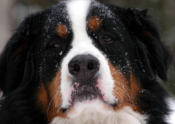
Cropped too tight. The snow is fun, but the grey day makes the photo a little dull for color, when the color would pop on a blue-sky day. I know you can't control that. But you could try a bit of color level adjustments in photoshop maybe. Cute dog.
Some nice textures in here, it's a shame it's underexposed. The part of the photo that should draw the viewer's eye in any shot of an animal is where the eyes are, and here that doesn't happen. It doesn't help that your model has lighter parts of his/her coat just above the eyes that draw attention away, so you need to be quite inventive with your composition to counteract this. Also, the eyes are just too dark with very little shadow detail. The crop doesn't quite work for me.
Good portrait of the dog with all the tonal range captured. With all that snow(?) on him/her, it might have been fun to show a little of the surroundings.
Obviously the first thing to see is that it is shot in landscape mode, but I'm sure a magazine layout editor could do something with it. The image is seasonal, slightly amusing, and could cover a topic about pets in winter or similar so I could see it on the front of the magazine. It's a tad soft, and the eyes are a little dark, which is disappointing as they seem to be my main focus due to the expression. A little dodging on the eyes could bring out the catchlight a little more and make them more pronounced.
(I'm writing this to everyone who submitted a landscape shot) The challenge was to produce a shot worthy of a magazine cover but to me a shot like this is not suitable to be put on a "portrait" format magazine.
---ADDITIONAL---
Due to forum discussions and accusations that marking landscapes down is nitpicking, I'm going through them and remarking. I still think some of the landscapes would not make good covers because of their orientation but I am no longer marking down because of that.
I still think landscape is inapropriate for the majority of magazines but I'll give the benefit of the doubt to the photographers.
Wow! This is an awesome shot. This is top quality and pitch perfect. I'm going to give you a high mark; however, you may find others will mark you down for having a horizontally cropped image instead of a vertically cropped image. IT seemed to be an issue in the last magazine challenge.






 Add photograph to your favorites
 Add photographer to your favorites


 Photographer found comment helpful.


