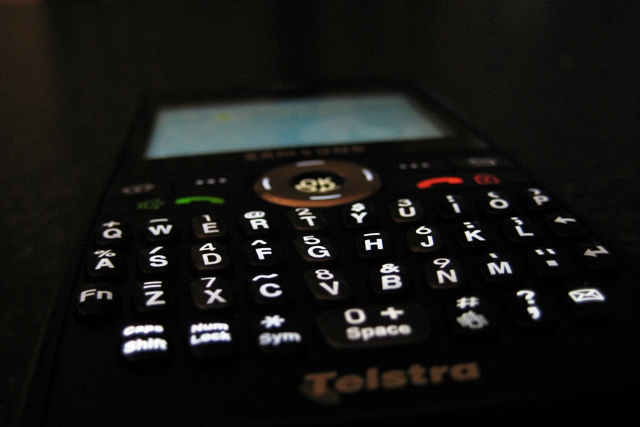
I like the shallow dof here, though I'm not sure that the tilt feels like it's enough or does much to impact the photo. In fact, I think I might have preferred no tilt here except the front to back tilt... it reminds me of the opening credits to Star Wars!
I think maybe a different color background would have helped here. Also if you this were a ad for some brand name and I was the company I think I would like to have my name a bit sharper, maybe a little less depth of feild.






 Add photograph to your favorites
 Add photographer to your favorites


 Photographer found comment helpful.


