Author Thread Comments Made During the Challenge
Post actions
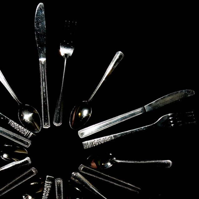
Great idea, but could be improved if the glare were edited out. Also, even though it's good to have some of the subject sl. out of the frame at times, this would be a stronger image if the circle were more in the center. I like the way the handles & the spoons are set up.
Post actions
Too much of the silverware fades into the black and there are distracting reflections on many items.
Post actions
Post actions
Creative layout, but the lighting/exposure could be improved. Would like this photo better if more details were visible.
Post actions
Grear concept, too dark imho.
Post actions
I realise you have probably darkened the image to get a good background which is good but the subjects are a little too dark now IMHO
Post actions
This photograph has a little to many shadows and hot spots. The cropping in this picture is awkward.





 Add photograph to your favorites
 Add photographer to your favorites


 Photographer found comment helpful.


