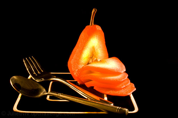
I'm not trying to sound mean, but the subject of this challenge is silverware and although there is silverware in your photo, you have made the main subject a pear; The silverware could disappear and the meaning of the photo wouldn't change...
The crop on this leaves to much negative space on the right side, and the lighting is too warm, as the color cast on the silverware is orange. Also, I think that I am missing the reason for the sliced pear, but the color is nice on that.
Very nice. The fruit's colours are very attractive and well-lit. I don't feel that the white lines on the platform they are sitting on (upside down dish?) adds anything to the photo. I think I would rather see it simplified by having it all black underneath. I would also like to see the white balance and little more neutral. Overall, one of my favourites though.
I am not too fond of the saturated and/or inverted colours for the pear. Frankly, i would have loved the picture with just the spoon and the fork. The negative space would have looked nice. But of course this is just my personal opinion. I like the lighting of the silverware a lot.





 Add photograph to your favorites
 Add photographer to your favorites

 Photographer found comment helpful.


