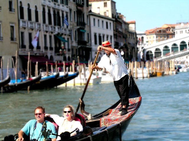
This shot just came up when I was on a parked Vaparetto, or water taxi, on the Grand Canal. In the background is the famous Rialto Bridge. This shot was uncropped and pretty much unfooled around with. Besides a little bit of contrasting, this is the shot in its originality. There is also a little blur added to the background and sharpening of the subject.
Statistics
Place: 123 out of 147 Avg (all users): 4.8362 Avg (commenters): 4.9000 Avg (participants): 4.6250 Avg (non-participants): 5.0449 Views since voting: 1199 Votes: 177 Comments: 12 Favorites: 0
Shot seems to much like a snapshot. Too overexposed. The composition is not effective, it looks like the photographer wanted more of the gondola in the shot and misfired. The gondolier's face is obscured by his arm. The couple in the gondola are not interesting and look bored. The background does not look like it has been thought about.
the transition from the people to the background doesn't look real. also, the composition is strange because the two people on the honeymoon are almost leaving the picture and they are the subject.
(I'm writing this to everyone who submitted a landscape shot) The challenge was to produce a shot worthy of a magazine cover but to me a shot like this is not suitable to be put on a "portrait" format magazine.
---ADDITIONAL---
Due to forum discussions and accusations that marking landscapes down is nitpicking, I'm going through them and remarking. I still think some of the landscapes would not make good covers because of their orientation but I am no longer marking down because of that.
I still think landscape is inapropriate for the majority of magazines but I'll give the benefit of the doubt to the photographers.
This shot might have benefitted from some rapid frames in succession - I would try for a shot where you can see the local's face as he is pushing the gondola.
I think there's too much going on in this shot. the scenery is beautiful and the people are distracting, unless the whole gondola was in the shot...Venice is awesome!
I like this! Unusual composition for this kind of motives. Nice glow in the woman's face. I wish the rowers' arm was a little lower so that we could see his eyes as well.
I like the idea a lot, but there are a couple things I would have done differently. I think a vertical crop that included more of the boat might have been stronger. It also looks like the blurriness of the background was largely added after the fact.
The lighting here is very harsh and you lose a lot of detail in the lady and gondoleer. The composition is nice (if a tad busy). I wonder if you had a little patience if you could have gotten the gondoleer without the arm in front of his face...
TC






 Add photograph to your favorites
 Add photographer to your favorites


 Photographer found comment helpful.


