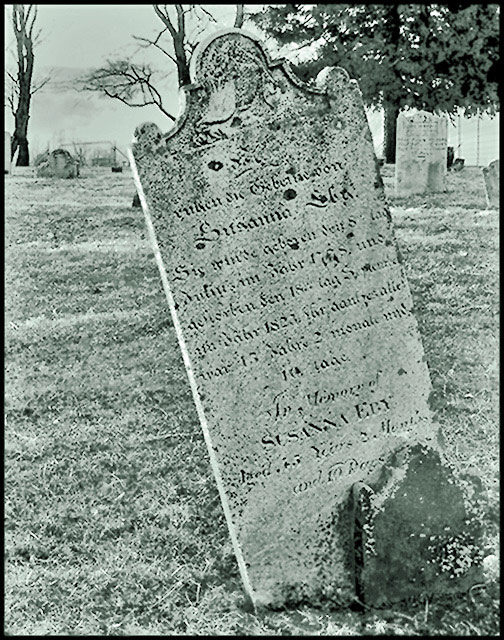
Very interesting shot. I love the idea, and I like the processing right up to the point where it gets a greenish tinge to it. If it was a straight greyscale it would work better for me. I like the uniqueness of it.
I am not sure the color tone is the right choice here. Think simple high contrast B&W would have had more impact. Also – likely because of challenge size limit – it is a bit difficult to make out the name on the headstone.
Over processed, I think that you have taken the curves slightly too far in this shot, and that combined with your black and white conversion the shot is left looking slightly blown out and unnatural.
-I just thought I'd expand slightly, I know how annoying it is when you get a two word comment.
i'm not sure if you did this on purpose or not, but the dullness, and somewhat out of focus along with the color tone give this photo classic look. It looks great. 10
I like the processing you've given this, but I think you would have had a better fit for the challenge (and a higher score) if you had rotated the camera to make the gravestone vertical.





 Add photograph to your favorites
 Add photographer to your favorites

 Photographer found comment helpful.


