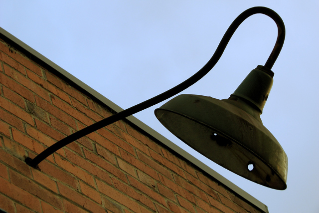
To dark in some areas, and flat in others. The bricks dont have much of a texture, and you cant see enough of the lamp as it is lost in shaddow. More contrast would also help
I can see how you tried to balance this image, but the color and light really need more oomph, especially with such a simplistic subject. Could be sharper, too.
Interesting! The angles really work and I like how they are angles I might see in real life (rather than rotated for the sake of it). The crossing diagonals work well.







 Add photograph to your favorites
 Add photographer to your favorites


 Photographer found comment helpful.


