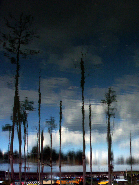
I really like the reflections in the water but find myself distracted by the colorful items at the bottom. I wonder how this would have been in B & W or with the bottom cropped. DPz
funny that you chose to send the pic in upside-down. i'd like to see a little more of the original trees, kindof a compare//contrast thing with the reflections. that's just me though.
I'd have cropped the bottom a bit, because in my eyes, the what-ever doesn't fit to the rest of the picture - the pic is blue dominated with the trees... and then the colors (esp. yellow and orange) don't fit at all... it's distracting somehow (What is it???) However, at all a nice shot, I like the double blue of water plus sky! 6 KAOS
I would have cropped the busy shoreline off the bottom and just the water filling the entire picture. The buildings and whatever the orange & yellow things are just detract from an otherwise beautiful picture.
I immediately liked this but when I got to the bottom of the picture the peaceful feeling of the trees and water and sky was shattered...lol There doesn't seem to be enough detail on the bottom to really add virtue to the image, so I think it would have been better without it. Nice anyway. Good luck in the challenge! Grayce aka Gracious






 Add photograph to your favorites
 Add photographer to your favorites


