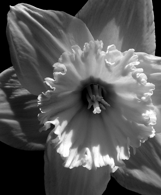
This is a nicely executed black and white. The choice for black and white really brings out the texture and shape in this subject. I think most of the comments you have received here about sum it up though.. For a 'Horticulture' magazine cover, I struggle with the concept of black and white. For a fine art magazine of some sort, this shot works nicely :) Some of the absolute best flower photos I have ever seen have been done in black and white. I think you simply introduced an opportunity for critique with the combination of the photo and the title.
Black and White not the best selection for a front page shot of a floral magazine, no? Apart from that I like it. Good job with properly lighting your subject and slightly off center composition works well.
It's a good shot with nice details on the petals and stamen. Could have done with a little more contrast as a black and white image. Like I said, it's a good shot, but I think for a flower to be able to carry off black and white, especially for a magazine cover, it needs to be absolutely stunning. Black and white flowers tend to be classy and/or moody, and I would expect a lot more vibrant color from a magazine cover. As a side note, I'm not voting you down for it at all, it's merely an observation.
This is a wonderful flower photo, the focus is great. I think it would be nicer in color. I don't remember ever seeing a black and white flower on the front of a gardening magazine as one of the main things in flower gardening is color.







 Add photograph to your favorites
 Add photographer to your favorites

 Photographer found comment helpful.


