|
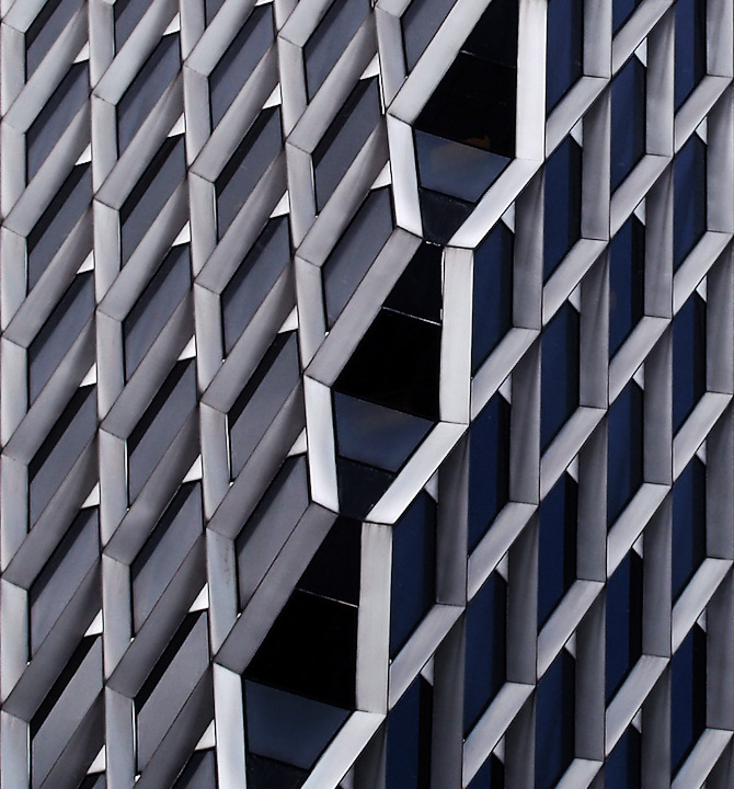
I gave this a 6. I thought the symmetry was fairly good - although to really nail a shot like this is very difficult in my opinion. The image wasn't 'strong' enough for me, for this type of image, whether that was because of the lighting, contrast, colors, not sure - just needed 'extra' to make it jump off the screen. The vertical framing seemed a bit off, perhaps a little more width, not sure. I liked the concept, but it was perhaps too close to the recent Architecture challenge for me and, as I said, had to have that little 'extra' to really grab my attention after having voted in that. |






 Add photograph to your favorites
 Add photographer to your favorites

 Photographer found comment helpful.

