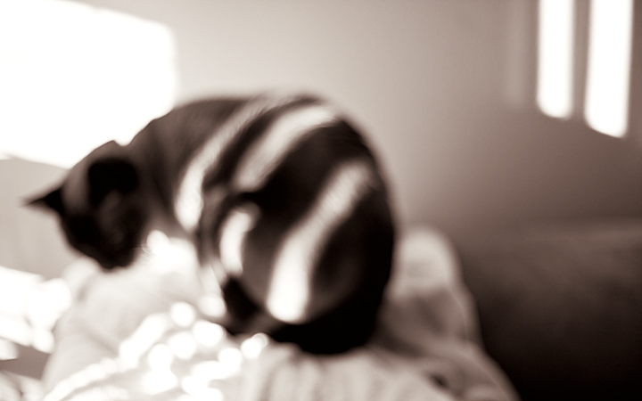
Interesting to compare the two. This version is more about light and shadow, with the shapes taking some time to resolve into a cat. I like it, but I like the color one better because it strike me more as an abstraction of a cat, without sharpness to confuse the mind into thinking the details matter.
I like the fact that you purposely defocused. It certainly puts the emphasis on the entire photo as a play of light and lines, as opposed to simply a photo of a cat, although I am sure that would have been nice as well, just not as thought provoking.
This photo is now being used as an example of how limited the definition of "technical merit" is. This photo would not exist without the "technical" decisions you made.
Yet some people claim that the "technicals" are not good on this photo. I might have to use this as a litmus test for my new Photography He-Man Club...
hmmm hmmm hmmm ok I think I like this one better than the color version BECAUSE you were trying to emphasize the play of light. By minimizing the color choices, one cannot help but pay more attention to the streaks of light and what it is doing all over the room. My favorite part tho is how the light turned into squiggles on the bedding. And it looks like kitty is ready to pounce on it too lol.
It's too bad that the site doesn't seem to educate enough people in the direction where they can tell that you weren't showing them a cat but the light that played on the cat. If the cat were detailed then it would be a cat shot...the detail would supercede the shadow and light.
I like the feel you bring forth of a waking haze and a cat crawling around you trying to get you up for some eaties.
Nice work.
This is an interesting abstract. I like the lights and darks and the way they are arranged. Obviously you left (or made) this blurred and it contributes to the abstract nature of the image. But my narrow minded preference is to see something in sharp focus.






 Add photograph to your favorites
 Add photographer to your favorites


 Photographer found comment helpful.


