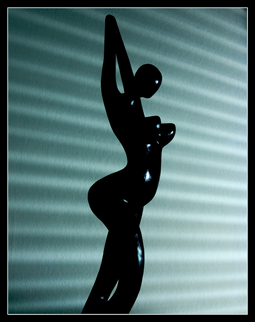
I love it when I get a great image to critique from the critique club queue. This photo is underrated for sure. The problem here is that I can't really offer you any 'critique' because I wouldn't change anything about this image. Everything you have presented here simply works well as is. Maybe I can comment on some of the comments you have already received...
Beagleboy - "A bit dark, but nice concept."
I'm not sure what he means by this, but dark is the theme of the image, IMO. I think you have a perfect mixture of light and dark. The subject itself is dark, and the subtle light and shadow in the background accents that nicely.
jpochard - "I like the potential here. I'm not sure how...but I'd like to see better lighting on the figure."
It appears to me that the subject is black. No amount of light is going to change that or bring out any more detail. The subject seems 'smooth' textured and adding light won't do anything but cast unwanted shadows on your background. "brett2004" made a comment about different lighting as well. His comment mentions casting shadows on the subject, which seems quite impossible since it's black. He also mentioned the centered composition, which seems to work fine for me here as well. It's a simple preference in a photo like this, but it works in this case. Moving off center wouldn't really change a lot.
The rest of the comments you have don't seem to be complaining.
i think this would have been more striking or powerful if you had a warm pin light illuminating the figurine and casting shadows down the curves. maybe could have been cropped a little on the right side so it wasn't so centered. this would add more interest to the figurine in my opinion. good luck!







 Add photograph to your favorites
 Add photographer to your favorites

 Photographer found comment helpful.


