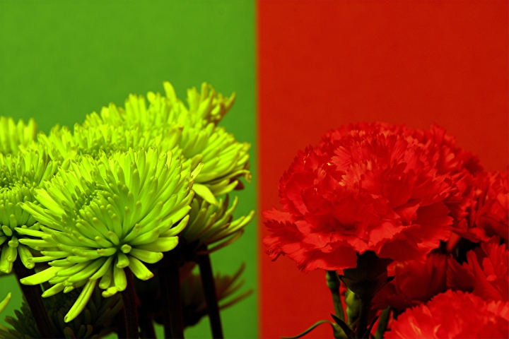
I took this shot on overlapped background paper. I arranged the green and red flowers in a vase and positioned it so that the flowers were infront of their respective background. It kind of looks like 2 photos badly stitched together. Sharpened, contrast, tint, noise, resize, save for web.
Statistics
Place: 153 out of 185 Avg (all users): 4.8060 Avg (commenters): 5.0667 Avg (participants): 4.4107 Avg (non-participants): 4.9104 Views since voting: 850 Views during voting: 394 Votes: 268 Comments: 15 Favorites: 0
By using both colors, you distract from the photograph. Its hard to determine which to look at, it would have been better if you had chosen only one color.
The picture on the left isn't as strong to me. I think you would have been better off only submiting the picture on the right. The left image looks unnatural and doesnt really look as good because the greens are so different, the one on the right has better compostion and is more focused.
I think a decision here would have made a much better shot. Both ideas were great, but together, IMO, does not make an asthetically pleasing shot. Hope this helps.
I do like these colours together but I don't think either picture is well enough composed to stand on its own.
Both the flowers are slightly pointing away from each other which separates the pictures and there's a little to much headroom for my taste.
Good detail and depth of field and I think the left colour is really refreshing, I'd have liked to seen more yellow in the background to match.





 Add photograph to your favorites
 Add photographer to your favorites


 Photographer found comment helpful.


