Author Thread
Post actions
WOOT! Nice strong finish Natalya, congrats!
Post actions
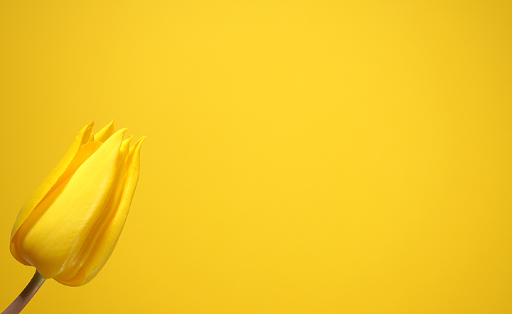
WOW this is so clear, clean, and definately yellow, and so pleased you did this one Natalya, as i love it.....
Comments Made During the Challenge
Post actions
Simple yet beautiful. Love the space. 9.5
Post actions
The lighting and colors are great. Good composition - wish there were a little less negative space.
Post actions
I like how the flower grows from the frame.
Post actions
Great use of negative space. Momething I need to learn how to use.
Post actions
Post actions
beautiful.. nice cropping
Post actions
not sure i like how this is framed, i would have put the flower just a little bit further into the frame, the left side is very close to teh edge, but that is pretty minor though. nice picture though
Post actions
The range of the yellows in the background add interset to the picture. Adding more of the subject would be a good idea thought.
Post actions
nice artistic approach, but the flower is dangerously cropped to the left, maybe a little more space between it and the left edge.
Post actions
Beautiful, simple image. 10
Post actions
Good picture should of got more of the flower.
Post actions
Beautiful shot. I would just have moved the flower slightly to the right, as not to leave too much space on the right. Just a little more application of the rule of thirds, in my opinion. Otherwise beautiful. Great lighting. 8.
Post actions
Post actions
Post actions
The yellow is a little dark on the right side, but it is still a very pretty photograph...
Post actions
Post actions
i think there is too much emptie space.
Post actions
The focus in perfext on the tulip. nice idea with the yellow on yellow, but not too much because the stem counters it. good work.
Post actions
It's a good picture and all, but I think there may be a little too much space. Maybe crop a little off the right side?
Post actions
Beutiful colour i must say,i really like this one so simple and so beautiful at the same time and also very well executed. This one deserves to ribbon. 9
Post actions
very good focus, good color. way too much empty space here. if you had cropped closer, we could see more of the details in the tulip.







 Add photograph to your favorites
 Add photographer to your favorites

 Photographer found comment helpful.


