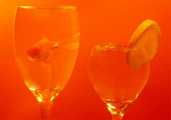
Unfortunately I don't have a studio or even a lighting system that would really make this shot really cool, but I haven't entered a challenge for a while so I thought I'd give it a shot.
Statistics
Place: 100 out of 185 Avg (all users): 5.5351 Avg (commenters): 5.7857 Avg (participants): 5.3636 Avg (non-participants): 5.5787 Views since voting: 1651 Views during voting: 384 Votes: 271 Comments: 16 Favorites: 0
Really cute idea, but the execution didn't seem to work out. Too little contrast? Out of focus? Maybe better lighting would have improved this. Still a great concept. :)
This is a neat idea, I just think it could be "worked" to be more effective. The composition is a bit flat. The viewer looks from the left to the right to the left, and that is just kinda it. Perhaps if the smaller glass was in front of the bigger one, and off to the side just a touch, it would set up a diagonal line to lead the eyes through the shot. If you needed one glass to be higher, you could sit it on something (catalogs work well) since that is cropped out anyway.
Also, while you have "color on color" there is little to distinguish the subjects from the background. It *almost* looks like you simply "washed" the entire shot with an orange color. A bit more light may help that. I have found that flashlights, or even my husbands worklights can give me a little extra "boost." If they are too harsh, you can cover them with a tissue or papertowel or something to diffuse the light (be careful, they can get hot).
If you already knew all this and this picture looks exactly like you want, my apologies. :)






 Add photograph to your favorites
 Add photographer to your favorites


 Photographer found comment helpful.


