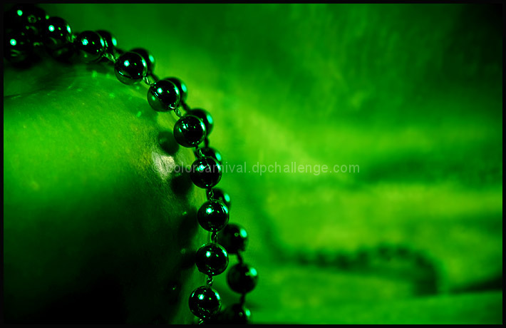
I found a beautiful Granny Smith Apple and in the right light, it was pretty close to being this vibrant. Tone down the bluish hint and you'd see it.
Of course, I did not have the right light for it while shooting. I kept messing around with the WB and could not get the right green color. I ended up using a camera feature that I had not tried before: I can adjust the Red and Green colors (R+ and G+) but I still don't know what it means because I have not looked it up yet lol.
Oh the background is a matching green mesh material. The colors of both were close.
Here is the original AFTER I did two adjustments in RAW:
I added the beads because I had them. That's really the only reason :) But what I liked is that it looks like there's a path in the background leading up to this apple. You just have to imagine that the path is going under the photo frame and coming up in front ;)
So I'm hoping that the beads and the brilliant color are not a turn-off. I really wanted to submit something vibrant colored and advanced editing allowed me to do that.
Statistics
Place: 81 out of 185 Avg (all users): 5.7197 Avg (commenters): 7.6000 Avg (participants): 5.4815 Avg (non-participants): 5.7810 Views since voting: 1075 Views during voting: 375 Votes: 264 Comments: 17 Favorites: 1 (view)
...The color of the apple and the background are too close together. There is no real delineation. Seeing the original RAW conversion I can see that the beads are providing that delineation but it wasn't clear from the submitted photo.
I do appreciate the feedback as it always helps to hear what others see ;)
I looked at this description: Take a picture of a colored subject or subjects on the same color background and went with the thought of the subject and background must match as closely as possible. And I think I achieved that. I guess it would be interesting to see how this would have done WITHOUT the beads. Live and learn. :)
Since you asked why your color on color did not resonate so well with folks I thought I would share my thoughts.
The color of the apple and the background are too close together. There is no real delineation. Seeing the original RAW conversion I can see that the beads are providing that delineation but it wasn't clear from the submitted photo. Also the background is a little too busy and draws my eye away from the foreground objects.
During voting I gave it a 5. Hope this is helpful.
I thought this was gorgeous. I kept coming back to this one but I never managed to leave a comment. I figured it would do well so why comment on a 9. Great comp and the greens look fabulous.
This is very appealing and I think the beads added a lot to the composition and the feel - added an elegance if you will. Very good, very rich color, too. It's easy to get green to be icky - here it's wonderful.
great job Michelle, I liked the way the texture of the BG is very close in appearance to the apple and the beads IMO add a nice element to the photo as well :)






 Add photograph to your favorites
 Add photographer to your favorites


 Photographer found comment helpful.


