Author Thread Comments Made During the Challenge
Post actions
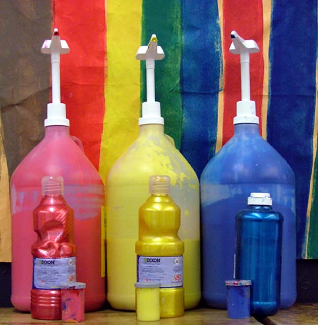
A sharper focus, and maybe a tighter crop so that the stripes in the background weren't showing would make this more effective, I think.
Post actions
Im not feeling this.
Post actions
Nice set-up but a bit soft.
Post actions
I could do without the backdrop... or one that's just the three paint colors.
Post actions
Colors on colors. I could buy that.
Post actions
Little more sharpness and contrast would have createda huge difference ....
Post actions
I think the gap at the bottom of the background paper is a little distracting and would have been a lot more effective if it had come down all the way.
Post actions
very out of focus and not ver vibrant.
Post actions
clever to get three "color on color" in one shot. Seems a little out of focus though. Maybe, it's the processing????
Post actions
wish it were more focused
Post actions
I feel this is slightly unsharp. Possibly due to jpegging?





 Add photograph to your favorites
 Add photographer to your favorites


