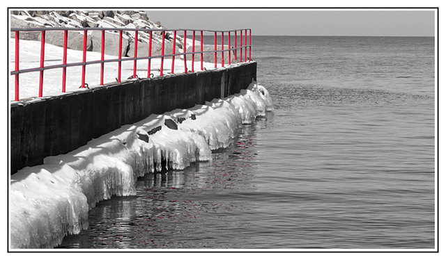
Love the red reflections in the water (shades of water challenge), and the slight irregularity in the rail. Pile of rocks upper left might contribute more with a simpler framing. (Ha, another FZ18). T
What a great desat. I like the red reflections but I think the red rail is over powering. Maybe if it were not quite so bright. I love the leading lines pointing out to sea. Maybe you should consider going back and waiting for a sail boat to pass right out there half way to the horizon. On second thought, it looks really cold.
I like that you managed to get teh red in the railing and the water reflection. I also feel that I would like to see this in all b&w b/c as it stands the railing does pop due to the color it doesn;t seem to be the main focus of this composition. Maybe a tighter crop for the selective desat or different angle and closer perspective, as Jason suggested, would make the railing more the main focus.
Are the horizontal sections of the railing red as well? They look a little strange in gray. What I think is cool is how you also kept the bits of reflection of the rail in the water as red, too. I don't think many people would have thought to do that!
I like it too! Its not overstated. You hardly notice that it is a selective desaturation because the pop fits so well with the photo. It looks like it belongs.
It is a nice red rail, but the ice is so nice! I would have prefered this with no selective desat personally. Also, it looks odd having the top rail and middle rail still gray....
I think if you had focused your attention on captureing the rail and made it the subject before turning it red (perhaps getting closer to it or from a different angle) then it would have worked better in the end...just my opinion though!
I don't know, I kind of feel like the red, as bright as it is, draws my attention away from too must of the other stuff in the image that is good. But then if you put the entire thing in b/w then the rail might just look out of place. I'd have to see it to know.




 Add photograph to your favorites
 Add photographer to your favorites


