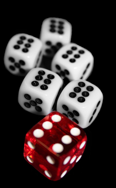
I think my first impression was based on the large red die up front. That's the one that grabs my attention first because of it's size and color. It's not in focus. After looking around a bit I've found the focal point on the second white 'six'. Really, because of the aperture choice, that's the only spot that's sharp. Technically that's fine (shallow DOF), but it's not where I expected it to be.
Did you consider moving the large red die to a point deeper in the composition? Arrange the smaller white ones around it some perhaps? Just a thought.
I like the choice of using a black background. Works well to isolate the dice.
Recently the trend has been toward square crops to gain the advantage of size, detail, and impact. This subject would have been perfect for that IMO. As it is, you only used 640 instead of the allowed 720?
In the end I guess the score was a reflection of subject material (hard to make static dice jump out) and the choice of focus point.
*** I just read the comments made during the challenge (prefer to make my own observations first without being influenced...) and it does seem that focus was the primary thing in holding this entry back.
Questions? Please feel free to send me a PM and let me know. Thanks!
nice, very clean background and great lighting, I think that this could be better with more negative space to either side - maybe have the line of dice going down your "rule of thirds" line, the only other thing would be a deeper dof, great job overall
I almost did this one!! I like the simple color theme. Focus on the front die could be a bit sharper. Since it is in front, and since it is red, it just screams for the viewer's attention. Since it is just a touch soft, it makes the entire picture feel soft.
I've also got some of these clear die and they are hard to focus on. I'm thinking perhaps the camera is trying to focus "through" them. I finally had to sit up a regular die, focus, switch it to manual, then shoot with the clear one.





 Add photograph to your favorites
 Add photographer to your favorites

 Photographer found comment helpful.


