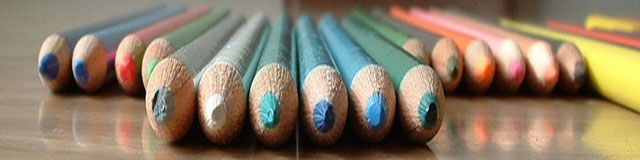
A good idea, and very colourful. Not quite so menacing as a previous one I commented on. these look rather friendly; especially the grey one with the broken point.
Good angel and DOF. Dont know if its lens disorentation or after processing but the dimention seem litle strange, think it makes the image better if anything. Dont know about the exposure but fine image.
Why do they look so compressed? Sort of like the final frame in a Chinese Karate film. I feel that the yellow marker on the right could have been eliminated to create more symmetry.
Very good idea. I can overlook a little distortion due to the wide angle of the photo but it becomes distracting to me when I can't seem to find the focus point. The fact that I cannot easily select anything in particular to focus on detracts a little from this composition. Also the bright yellow pencil on the right creates a boundary that should be mimiced on the left of the photo. The intensity of that color seems to draw attention to the lack of balance. Very good idea and a decent attempt. I think if you worked with this more by perhaps put down black construction paper and laid clear plexi over it to remove the wood grain while keeping the reflection, then worked on a little more symmetry and getting a slightly more pronounced focus point/subject this would be a killer shot. As it is I see it as a 5.







 Add photograph to your favorites
 Add photographer to your favorites


 Photographer found comment helpful.


