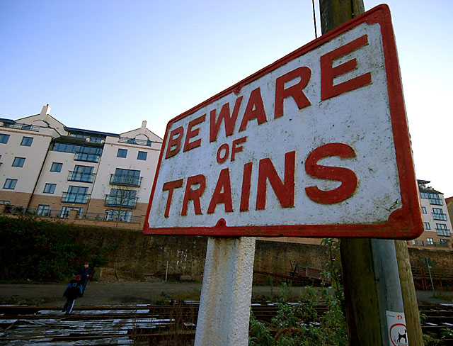
I love distorted shots and signs and the colors in this are great, but the lines don't go anywhere. Maybe if you put the sign more to the right and had more negative space it would work better.
I like how the perspective makes the edges of the sign lead toward the tracks. Kind of ironic since the challenge said the lines should lead to the "impact" of the image. :) Well done. (Be careful around the tracks.)
Only comment would be to brighten it up a little and try and bring out colours a bit more. Love the fact you have used the sign and row of houses as the 'theme'. I am sure there will be many who miss that entirely!






 Add photograph to your favorites
 Add photographer to your favorites


 Photographer found comment helpful.


