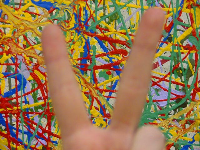
The focus on the harsh background suggests violence, since the OOF hand is obvious, I think you were trying to convey something. The title of the image could be used to convey such things.
Interesting choice to focus on the paint, which IMO looks almost angry with the bright primary colors furiously overlapping one another every which way. The OOF peace symbol made by the hand doesn't manage to overcome that feeling for me despite being a large part of the foreground.
Why is the drip painting in sharp focus and the hand out of focus? I assume that you have done this deliberately and since I don't understand why, the image is not successful for me.
The hand being so out of focus makes this not say "Peace" to me as much as if it were a bit more focused. As it is, my eye just tries to move it out of the way so I can see the subject.
I might have liked this better if the hand were in focus and the background were fuzzy. Also maybe show a little more of the hand to get the peace sign more clearly.





 Add photograph to your favorites
 Add photographer to your favorites


