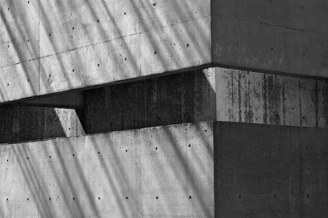
Nice idea--I think the right portion is distracting--I would have suggested a crop, either all, or if you wanted the corner, maybe just include the first quarter inch of the facing plane.
A nice bit of 'brutalist' architicture, and the black and white (I assume it IS in B/W) suits it very well. Grey, and suitably so. I think this is good; although the same applies as I have commented on others. A little uninteresting and very stark. But I don't think that is a minus in this instance.





 Add photograph to your favorites
 Add photographer to your favorites


 Photographer found comment helpful.


