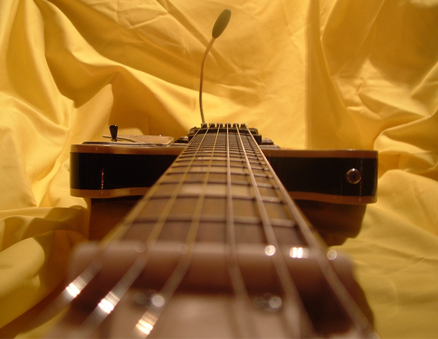
Think you'd have gotten more emphasis on the parallel lines (strings) if you had reversed the depth of field with it starting n focus and fading into a blur. This way the emphasis is pretty much on the backdrop.
No more guitar shots!!! Please! I beg you all! Take a look at this challenge...there are 25 friggin' shot just like this. The most important part of your shot is not color...not composition...not editing...it's SUBJECT MATTER! Make it count.
Interestiing idea. Maybe you should have showed us a litle more of the guitar it self and maybe you should have had it further away from the bacground sheets and try to increase the apertrure to try to blurr it out. But its an OK image and I like the warm WB.
Good idea for the challenge..however the shallow dof could of been cropped out, and I would like to suggest a new background......or at least iron this one. :)







 Add photograph to your favorites
 Add photographer to your favorites


 Photographer found comment helpful.


