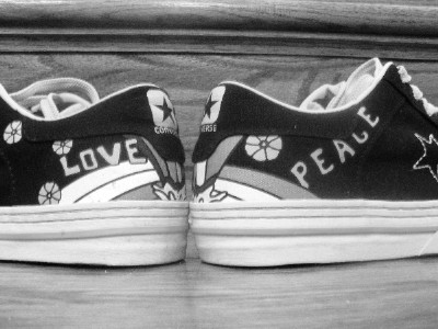
My first thought was I would have liked to see the shoes more symmetrical between the halves, but with the writing spaced differently the words are symmetrical. You should have used the full 640 pixels. The horizon appears to be slightly tilted based on the line near the top. The focus is a little soft. Maybe the title could have been "Love and Peace All-Star Style" to match the flow from left to right.
Nice idea! I'd like to see it done with a better setup of the shoes. I find the stair edge distracting. I also suspect that color would be better to show off the designs on the shoes.







 Add photograph to your favorites
 Add photographer to your favorites


