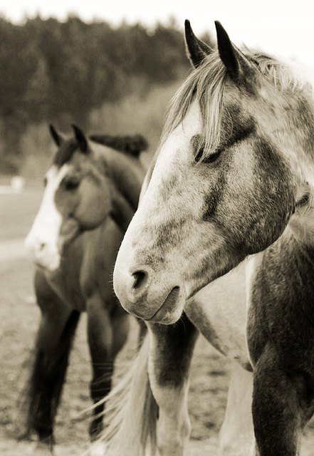
I like this shot, but I think it could have been done better. I feel the head is cut off from the body of the horse. I would have liked to see the full horse in the forground. Did you crop it? I do like the angle you chose and the way the horse are looking in one direction. I see there were a few animal shots that did pretty good, so I don't think it is because it was not meeting the challenge to alot of folks.
4.7 average for an image of this quality is unbelievable.
My take on that is that you have suffered because the parallel links were not of the obvious or expected kind and the large volume of submissions for this challenge meant that people did not spend too much time looking.
Beautiful image and great capture. Either you are very lucky or very patient (or both). Technically perfect and very creative and artistic. Think the sepia color suits it very well.
Lots of lovely parallels here. Probably two schools of thought as to whether both horses should have been in focus. I happen to like your interpretation very much. Glad you chose it.
Gorgeous capture of the horses. I love the texture you got here. I think that I can see how you wanted the parallel to be defined with the two heads and two tails and that I can see but it doesn't seem to fit the "lines" portion. I ike the capture but choose to vote it an average score. Perhaps I'm just missing the lines you wanted to bring out but after looking at it for a little while the closest thing I see is the right front shoulder of the horse in the FG and the right rear leg of the horse in the BG. Those muscle lines appear to be similar but they definitely don't seem to provide the strength of this photo. Having said that, I think this is a lovely capture that I'd love to print and hang on my wall if I'd taken it. It has an organic and natural feel to it and I love the duotone effect you put on it. Just don't like it too much for the challenge.
{update} After further review and being contacted by the photographer during the challenge, I will reconsider my hasty remark above and say that the challenge is well met.
I initially concentrated on the two heads of the horses. The title being "Double Vision" falsely led me to focus on the faces of these horses. I wondered what was parallel.
Now that I look closer, I "see" the "rhythm" of the photo... Horse Head - Horse Rear - Horse Head - Horse Rear. This rhythmic pattern, though not geometric, is in fact parallel in nature.
The gal from New Jersey has been vindicated and her score from me will now better reflect her artistic vision, rather than my accute mathematical awareness.
I like the picture a lot and I like the thinking behind it.
That should score more points for not being a run of the mill picture.
But I don't think it fits in with what they wanted for the challenge.
And I think that is what should more points should be given for.
Sorry.






 Add photograph to your favorites
 Add photographer to your favorites


