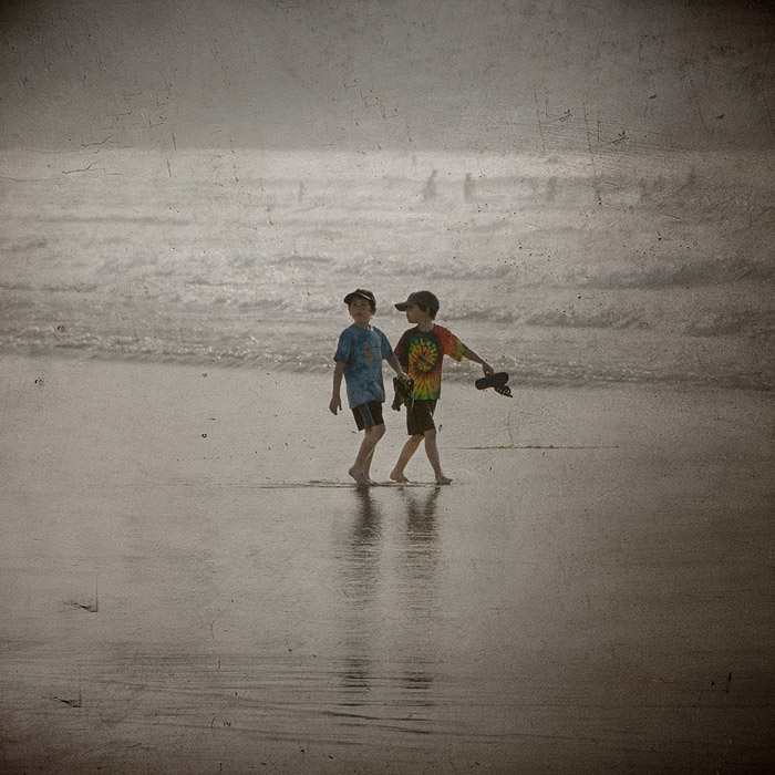
Woah - this is a shot that rewards a lingering view; first, I see those little boys lost in the gray surrounding expanse, then I see the delicate traces of their shadows in the sand, then the dim shapes of the swimmers beyond them.
I think that centered works wonderfully well here, as does the slightly muted splash of color. Nice subtle texture, but you may want to go back and work over several areas where there is some noticeable cloning in the overlay.
This looks so Southern California it hurts. Everyone assumes that we have sunny skies the whole year, but as you well know, June Gloom and its attendant gray sky and gray water can start about April and run into August (at least up here on the Central Coast). I really like how the boys tie-dyed shirts give a welcome splash of color. The square format makes a nice change.
Personally, I love it centered and I love the scale of the subject with the negative space. My eye is drawn directly to where you want it it to go. I am a big fan of how negative space can make a picture utterly fantastic! It's really a wonderful, artistic composition.
Larry, I appreciate your thoughtful comment! Of course I heard about the rule of thirds, but decided to break it anyway :). I like the centered composition here, but of course it is a matter of taste. Color shirts: I tried to go BW or sepia, but (again, to my eye) it did not look as good, the kids were kind of lost there, so I decided to leave it. I did subdued the colors a bit though, maybe I should have done more of it...
I like the scene, but two things bother me. First the two kids are centered in the image. Given the directions they are looking my inclination would be to crop a bit off of the bottom of the image. The second things is that I wonder if this would do better in black and white. The way the filter makes the image look old the color on the shirts stands out more than I think it should. Part of that is because it is the only real color in the image.





 Add photograph to your favorites
 Add photographer to your favorites

 Photographer found comment helpful.


