this really is a great portrait and i gave it a 9. i really wonder whether there is a bias toward female subjects in these challenges. cool kid, wonderful treatment.
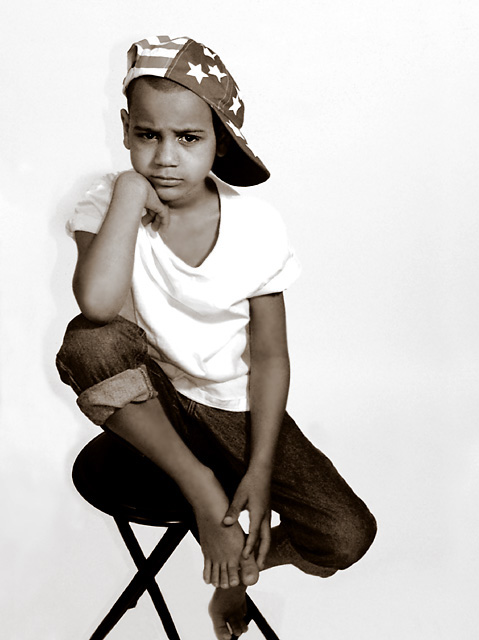
Thanks for the comments.. I was afraid of eliminating the shadow. This is how it was (pretty much) out of the camera. No I didn't add it afterwards! LOL
I didn't want him to look pasted on the background.
Thanks to my son for cooperating for this. :)
High Key and very cool. Can't tell if he's posing or really not impressed :)
A framer for sure. Some people may not like the high contrast, but i think it fits. I might burn a little around his shoulders (or put him in something slightly off-white next time) so they don't completely disappear into the backdrop, but that's being pretty picky. I keep coming back to this one. - very nice.
Pedro
wow! this is something different...like the expression on his face...good white background...what I don't like is the shadow....aside from that everything is nicely done....gave you 9 for this...
Very, very nicely done except for the shadow behind his right shoulder. A bit of diffused light on his right hand side of his face would also have helped. But what a shot otherwise! Great job!
I like the sulky expression - makes a change from the forced smiles in some entries. I think the composition doesn't feel balanced - he's not far enough off-centre for it to feel deliberate, so I'd crop to centre him horizontally. I would also avoid cropping off the bottom of his left foot. Exposure seems a little harsh with top bleeding into background - I wonder whether, for a black and white shot, a non-white Tshirt would have worked better?
This is a great portrait - challenging expression, great long diagonal pose, and sepia definitely adds. If I have a tiny suggestion, it is the shadoow on the left in the background. Moving the subject away from the wall might have reduced this but maybe it is better with than without!
This is really fun! His expression is great (I have three boys and know that expression well). It gets a 9 from me. It would have been a 10 except for two minor flaws... Thiere is a slight shadow to the left, and his toes are cut off at the bottom. Very minor issues, as this is a great image!
JD






 Add photograph to your favorites
 Add photographer to your favorites

 Photographer found comment helpful.


