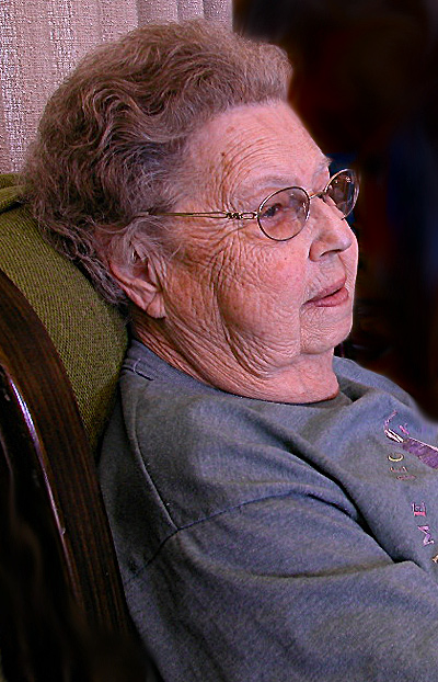
Composition - Not a bad idea for a portrait. I think it needs a little polishing. This is just a little too informal for my tastes. I prefer backgrounds and light that I have more control over. Sometimes these portraits are some of the best, unfortunately not this one. The biggest thing to me is that with all the details and lines of interest in the face of your subject, you've lost a lot of that with the lighting. A little underexposure here would add a lot of interest. There is a lot to be done with shadows and also greyscaling that can really make a portrait of an older person pop with a very intimate, often emotive tone. Clothing is also something I'm looking at. I'm not thinking she dressed special for this portrait.
Technical - The lighting is very flat on this one, to the point that I would have thought you used the flash if you didn't say anything about it in the comments. Of all the things that I can see in this picture that I like and don't like, that was the very first thing that came to my attention. You might have considered a lower camera angle as well. I think I'd have greyscaled this and maybe even added a little grain for effect. But what do I know?
Overall - Too many unpolished edges to this one. The clothes, the background, the lighting, these things all weigh pretty heavy with this one. I find that it would be hard to do a flattering portrait of this person, but an interesting or intriguing portrait is there to be had. Good luck in future challenges. - Bob
The tales she can tell! I hope she has had a good 80 years. The shot is a bit too snapshot looking. The chair, drape and the print on her shirt are a bit of distraction.
Very nice subject. I like the lighting and skin tones - and the expression. The one thing that would make this even better would be to capture a bit more of the background to the right. I know it isn't the point (since it's a portrait), but it's like the subject is looking out into something, even if it's just part of an empty room. You kind of want to see what's making the subject "tick." Also, the way it's posed calls for the image to extend a bit more to the right. Overall a great shot though!
Those curtains in the background really take away from the photograph and the green chair doesn't add much either. Now, the woman is a great subject and you capture a nice photograph of her face!
A great subject though perhaps a not so flattering location. The textured, flesh coloured wall in the upper left in particular really doesn't enhance the image. Something outside or near a window might give you some great portraits




 Add photograph to your favorites
 Add photographer to your favorites


 Photographer found comment helpful.


