Author Thread Comments Made During the Challenge
Post actions
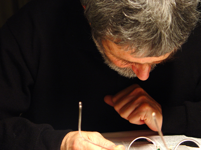
This is cool- I like the magnification in the glass and the fact you can't see his whole face- great job 9
Post actions
Good idea, but no good solution, I'm afraid
Post actions
2 - I need to see more of his face to get the message .. sorry. Moody shot.. good idea.
Post actions
I like how this portrait tells me something about the person. Nice job!
Post actions
interesting shot...for a portrait I really like to see the eys and the glasses caught part of the hand and magnified it a bit
Post actions
a very neat take...colors are great as is the lighting. ..looks like an early master's painting.,8
Post actions
Not enough of the subjects face showing.
Post actions
Post actions
A great capture of the subject's personality - something every portrait should strive to do. I like the tones and the lighting.
Post actions
It's neat how his shirt almost dissapears. Nice shot and focus
Post actions
Nicely done. For my taste though, I would like to see just a little more of Fans' face.
Post actions
Putting your subject in their element is a great thing to do but Frans could be giving the impression of reading with his head up just a bit to see more of his face. Great lighting - just a bit bright on the foreground hand.
Post actions
I like this man and I don't even know him...
Post actions
Lacks focus and more of the face in view would improve it.
Post actions
The black of the clothes blends in with the backing too much, leaving the face floating in space.
Post actions
We just see the top of his head and not the person. :(
Post actions
interesting composition, it makes me curious as to what is going on
Post actions
Tells us a lot about Fran - nice composition, well balanced left to right.
Post actions
A nice shot but I think it would look better in black and white and would like to see more of the face, even though he's reading. A 6







 Add photograph to your favorites
 Add photographer to your favorites


 Photographer found comment helpful.


