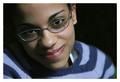
1. Sheet is blurred with gaussian blur 4.0 radius.
2. Feather the edges of the selection.
3. Desaturate.
4. History brush the eyes back in.
5. Saturate the eyes and change the colors a bit to enhance the blues.
6. Clone and healing brush a bit to get rid of my camera noise in major areas.
7. Add border and brighten outside the border.
That's all. :) I love this shot. I hope it does well.
Statistics
Place: 23 out of 135 Avg (all users): 6.2673 Avg (commenters): 7.0645 Avg (participants): 6.0686 Avg (non-participants): 6.4435 Views since voting: 1984 Votes: 217 Comments: 41 Favorites: 2 (view)
Beautiful rendering ... very successful and thank you for the extensive notes! It is something worth emulating. Your model is also very beautiful. I just don't understand why anyone could vote "1" for this shot. The techniques alone to arrive at the result are worth a lot of points (it shows though, over 70% of your readers showed they appreciated this). Congratulations.
No, I understand. And I definitely thank you for the thoughtful and long comment. I do definitely appreciate those. I guess...when I make a choice in a photo, I've definitely done so for a reason. I didn't submit for about 3 months because I got kinda aggravated by making choices others didn't like. I am more focused on learning how to take a good picture rather than the likes and dislikes of my audience. I want an editor for that. ;) But thanks again, really. I do appreciate the effort.
I woud never say that I thought it sucked - I just didn't think it was necessary, and as you put it - a gimmick.
I gave it a 7 by the way - i don't punish shots for doing things that don't necessarily suit my personal taste. As i said - i loved the shot save that little detail.
Thanks achiral. It was about 50/50 on "The blue eyes rock" and "the blue eyes suck." I figured I'd separate from the rest of the b/w portraits with the color - but I guess those like Pedro think it's a gimmick. Maybe it is...though crab did it and got like a 6.8?
*shrug*
Thanks for the comments. I love this shot. Everyone here loves it. Mission accomplished.
Yay you (and yay maggie lol) Its good to see another photo in your top scores.
*looks at time. Oh shit I am still within first 5 minutes of this challenge ending. Will I get the 'predictable' speach again?* lol Oh well I am not the first this time lol
And by the way on the photo, I just read the comments on this photo. I have to say that I agree with your choise to make the eyes stand out like that, despite a lot of people disagreeing with it. The eyes are teh key to the sole, plus they are also the first thing you will ever look at in a photo on a person, so its only right that they be a main focal point.
I like everything about this photo except for the colorized eyes. This portrait is so strong that it stands on its own without that gimmick I think. She does have beautiful blue eyes, but if you are going to make this a BW image I think you need to commit fully to it being BW.
Your crop is so good here with the nice diagonal lines and the expression on her face is marvellous. I bet the color version is a beauty as well.
The halftones are wonderful but the blue eyes are fantastic. This picture can only be fully appreciated when enlarged so the young persons eyes capture you. Very good work and creativity. Just the right amount of color.
It's the look and the smile more than anything that arrests the eye, one wants to be part of the world of that reaction. I don't usually like it when people make the eyes color and the rest of the photo monochrome but it's okay here. Nice framing. - 8
Super job! You've captured a lovely expression, did a wonderful job converting to black and white while preserving those baby blues, and framed nicely too. Personal nit about the frame is I would rather that the outside frame be solid, not see through. Does that make sense? But a stunning portrait in any event.
I don't suppose I'll be the only one to say it, but this one could have done without the blue eyes and the translucent border. Both are tricks that average photographers use to try to fool the viewer into thinking it's something unique. well friend - this picture didn't need that. aside from those effects, it's absolutely perfect. she's just an angel with loads of camera appeal. the technicals of the phots are great as well; soft lighting, no harsh shadows, nice desaturation, nice crop...and that grin! awesome. it won't score as well as it should have. make this into a regular duotone and frame it proudly.
(no offense intended - just shooting from the hip)
Pedro
Lovely photograph of a very charming you lady. not certain about the colouring in the eye's and I would have given it some more contrast, but the smile on her face is wonderful. well done
A pretty portrait which I would like a lot more without the selective desaturation. Overall it feels a little grey to me though - the whites/ highlights aren't looking white enough. Lacks contrast I think.
You are not alone using the blue eye "trick". Without it, this is an appealing portrait, nicely lit and well focused, the pose with a slight tilt makes the composition and the hat is great. Do the blue eyes add or detract? Your choice!







 Add photograph to your favorites
 Add photographer to your favorites

 Photographer found comment helpful.


