| Author | Thread |
|
|
03/05/2008 12:52:59 AM |
|
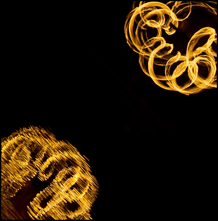
I liked the shapes and the large amount of black. But I think many voters don't like the main parts to be separated by so much empty space. Your choice of aperture was perfect. |
|
 Photographer found comment helpful. Photographer found comment helpful. |
|
|
02/22/2008 01:20:17 PM |
Hi,
Very nice image, I particularly like the way you captured the motion and reflection here, must have had a hell of a time getting it done. Your exposure seems to be just right & the focus nice and sharp, a nice job was done here conveying motion. The one thing I kept coming back to was the dead space, it just took to much of the image in my humble opinion. But overall this is a great image. |
|
| Photographer found comment helpful. |
|
|
02/18/2008 11:14:15 AM |
|
wow i thought this would have done better... i think you got cheated! :( oh well... nice job anyway! |
|
| Photographer found comment helpful. |
|
|
02/18/2008 12:22:27 AM |
|
Excellent symmetry; I was one of your 10's. |
|
| Photographer found comment helpful. |
Comments Made During the Challenge  |
|
|
02/16/2008 06:55:53 AM |
|
So elegant and simple! I really like this idea ... much more creative than many in the challenge. |
|
| Photographer found comment helpful. |
Theme:
Classic /
Light /
Dark
Home -
Challenges -
Community -
League -
Photos -
Cameras -
Lenses -
Learn -
Help -
Terms of Use -
Privacy -
Top ^
DPChallenge, and website content and design, Copyright © 2001-2026 Challenging Technologies, LLC.
All digital photo copyrights belong to the photographers and may not be used without permission.
Current Server Time: 10/18/2026 04:06:36 PM EDT.







 Add photograph to your favorites
 Add photographer to your favorites


