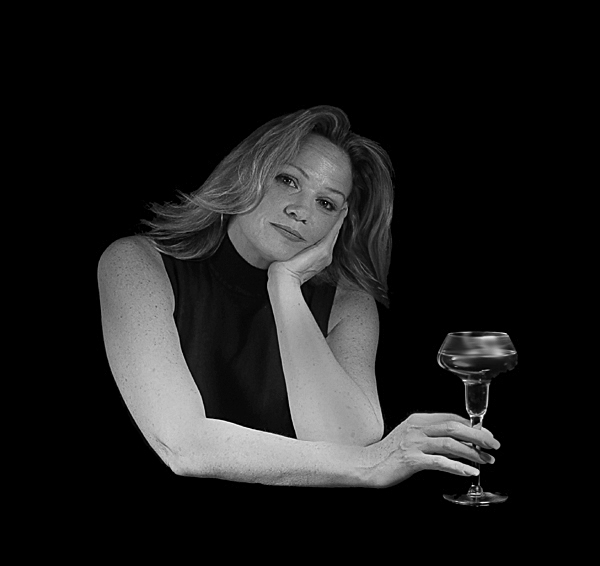
This is a very good portrait, and I like the pose. I might have cropped it closer. My eyes travel all over the photo at the black space and because there is so much, it accentuates that the rest of her body 'missing'.
almost like floating in nothingness. there seems to be an area on her right arm that has much more light than the rest. I would have liked to seen a bit more soft diffuse light up onto the face. there seems to be a little aberration on the bottom of her right forearm, also
Beautiful, sensitive portrait of a woman in her prime. The range of lighting, particularly, is effectively gorgeous in that it associates her disposition and character (facial features and posture) with her age (harsher lighting on elbows, arms, left wrist and hand). The sensuality emphasized by the manner of this capture is neither simple nor common.
The glass, btw, makes a fine anchor.
I really like the overall effect with one small exception, and that is that the arms stand out so much against the background in comparison to the face, drawing the eye away from the face. Maybe that was on purpose but, if not, maybe a little more light on the face wouldn't go amiss. - 7
I wish her hair was lit better. The drink is sort of unfocused, oddly, because everything else is well focused. For my tastes, too much black so I would have cropped closer. Mostly, though, give that hair some light!
Nicely done. The only thing that bothers me is the sense of wanting a table or somethng under the glass. . . especially the way the model is holding it. I really like the black on black which features her. BOL.
i was going to do a shot really similar to this but I couldn't convey what you've done here so I chose a different topic. You did a great job. I love the relaxed pose and the glass of wine/water. You really captured the essence of mood and it's very well composed. Good luck!
the almost full on / square shouldered pose isn't always the most flattering, tending to make people look wider than they actually are. The hands and arms are well posed.
I like the idea behind this shot..maybe the exposure could have been adjusted to improve the image..but I do like the overall effect.
I tried a unusual exposure theme and it`s getting murdered..hope yours fares better.
This is a nicely composed piece that looks flat because of the lighting. If you move your lights off to one side or the other more it would give more depth.
TC
this is very nice...I like all the black around here and with her wearing black is very dramatic...she looks very much at ease and you have taken a fantastic shot







 Add photograph to your favorites
 Add photographer to your favorites


 Photographer found comment helpful.


