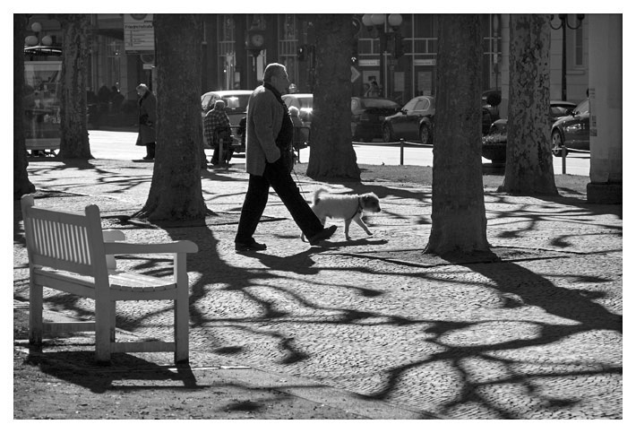
Based on feedback, I've re-edited this. Converted by desaturating in RAW, and added a bit of "fill light"; used a bit of shadows/highlights in PS CS3 to bring out more highlights. The issue now becomes whether it's too busy/cluttered when one starts bringing out the detail?
I agree with Steve. Something a little more in the middle may be best. Although I do like this better than the darker one. The appeal for me is those shadows that help lead me to the man and his dog. It would be better if that bench wasn't there.
It certainly is more bust than the other, but I also think it's more interesting. In this version there is a lot more stuff to look at, and those additional people make it more interesting.
Yes! I love the detail in this one. It still has an artistic silhouetted look, but it gives you an inside feel of the "story" in the photo. That looks like a fun area to hang out and take urban photos.





 Add photograph to your favorites
 Add photographer to your favorites


 Photographer found comment helpful.


