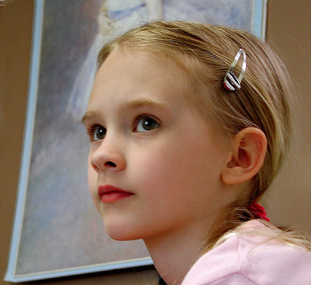
Poor you Vtruan you didn't even see the beauty you held at the desivement moment of clicking your shutter. Its a shame to because you could have has a real tried and true beauty. Look at the painting in the back ground the way your daughters hair and face is done up and being of a soft nature flow beautifully with the painting but you cut off the girls head in the portrait. No vtruan your mistake is not to realize the beauty of that poster and have used it to your advantage. I am sorry most of these people know shit about the back ground here its so beautiful and would have completed your image if you had cropped it right by placing the head inside and maybe moving over just enough to see more of it contrasting with your daughters soft characters but hey next time you'll see it maybe. Thank you for the image.
Thanks for the great consistent comments. It was a candid of her at her ballet studio. She has some cherry candy before I shot her, no make-up/lipsstick. Yes the poster in the back should have been removed. I removed the foot below her chin, but didn't have time to finish removing the rest do to the whole family being flu ridden all week and didn't get back to it. Van
She's so pretty- she's such a little girl, this is great- the hair clip for some reason I really like- the poster's a little bit distracting but I really love it 9
I like the catchlights in the eyes. They bring a real sparkle to this young lady's face. I also like the Degas you've used in the background. That adds a special dimension to your portrait.
Great expression, lighting and POV. The background picture is distracting- looks better to me if I simply crop the left side just enough to lose the frame. The color is a little overdone (particularly the red). That said, this is still one of my favorites. Should be in the top 20 easily.
This is a lovely portrait of a beautiful young lady and I love the concept here of having the painting in the background to which the subject is set against. I do, however, think there are improvements that can be made. First, I'm wondering if the painting has real relevence to the subject, in terms of, likeness or some kind of similarity. Also, I don't like the fact that the head of the subject in the painting was cut off. I do love the pose of your litte woman, and she is darling, but I would have preferred crisper focus on her face (it appears that the focus is better on the side of her face) and I also would have preferred that she wasn't wearing the shiny chrome barrette and red pony tail holder, both of which I find distracting. And also (sorry this is so long :), I think she should be wearing a colored blouse that matches better with the painting above and a color more subdued than the one she is wearing, which is bolder and does'nt match her lipstick or the painting. I hope this helps. 8
The shot reminds me something more candid than a portrait. The thing in the background is very distracting. My eyes kept trying to figure out what it was other than focusing on the girl.
The lighting is good, the pose is good, the angle is good, but the painting hanging in the background is a little distracting and throws off the balance for me.
With an excellent model like this why did you stick her in front of an out of focus painting of someone else? Or was this intentional - is this her in the background? But having to ask that question negates the harmony and beauty of the model's pose. A 7 when it might have been an 8 or 9.
I love the expression here.I don't normally like to see little ones wearing makeup but it was a good idea for this shot (and maybe you didn't even put makeup on her - if not, she has great colour in her lips). I like the use of negative space as well. Good luck!
What a beauty. Unfortunately the princess in the background takes away from the princess in the foreground. The blank tan wall would have been a much cleaner background and aded to her color! BOL You stil got a good rating from me.
This is a lovely picture, nicely lit. Perhaps it would have been better (really great) without the picture hanging on the wall in the background. Maybe you had to put the speed up to meet the lighting conditions, so there is a little chromatic noise but it doesn't detract - NeatImage would remove it if it bothered you!
The girl is really sweet and the pose and angle too, is that thing in the background that is a bit distracting, I wish you would blur that a bit in photoshop...
your model looks very much at ease and comfortable posing...the composition is good...catchlights are good...the picture in the backgound really draws the attention away from your model though...
Nice shot....there's some pixel problems in the eyes and mouth. Just to let you know. perhaps it could be caused by many things. But, I rate you above average. Nice photo over all.







 Add photograph to your favorites
 Add photographer to your favorites

 Photographer found comment helpful.


