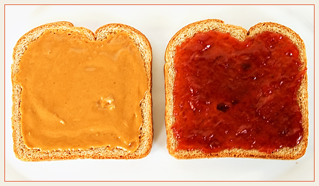
This is the third shoot for this challenge ... kept trying different ideas, nothing I really liked a ton, but I think this one might do OK in the challenge -- has that graphic feel DPC seems to like. A little blown out on the left on the plate because I adjusted the WB a bit more than needed to true up the colors in the jelly.
Would have liked to clone out that crumb below the jelly slice, but its Basic rules. :>(
Statistics
Place: 95 out of 167 Avg (all users): 5.1223 Avg (commenters): 5.7143 Avg (participants): 4.8750 Avg (non-participants): 5.2182 Views since voting: 995 Views during voting: 340 Votes: 229 Comments: 9 Favorites: 0
This isn't the way one normally sees a pb&j, and that's what makes it good. The symmetric composition is cool. If you got rid of the shadows and crumbs, this would be right at home next to Worhol's soup cans.
Over-sharp, over-saturated, possibly over-sharpened. I think some American people like the goop that's concealing the bread, but it looks pretty ghastly to me. Nice job of getting the subject isolated from the neautral background.






 Add photograph to your favorites
 Add photographer to your favorites


 Photographer found comment helpful.


