Author Thread Comments Made During the Challenge
Post actions
Nice, simple and to the point.
Post actions
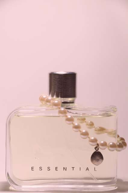
Great focus on the main body of the bottle, the soft edge around the lid is a little distracting, but I can understand that its difficullt to light a shiny object like that evenly. Inclusion of the pearls really adds to the shot.
Post actions
Post actions
The background is too light for my taste. The bottle top looks out of focus.
Post actions
I think a tighter crop would have worked better here.
Post actions
good idea. they go well together
Post actions
The OOF cap drops this from a spectacular shot to a no show for me. The pink background (nice and even) gives it the essence, and the blurred cap just stands out in stark contrast to the rest of the image's feel. 6
Post actions
There is a lot of negative space that takes away from your photograph. I do like the background colorand all the shapes you used in your picture.
Post actions
Simple and elegant. Looks a bit flat. Some contrast and Selective Color tweaking for the whites would really make this pop.
Post actions
are you trying to say that pearls are essential for girls, b/c I thought that was dimonds?
Post actions
Post actions
Color scheme and cop would work really well in a perfume ad. However, the soft focus on the cap detracts from the attractiveness of the product.






 Add photograph to your favorites
 Add photographer to your favorites


 Photographer found comment helpful.


