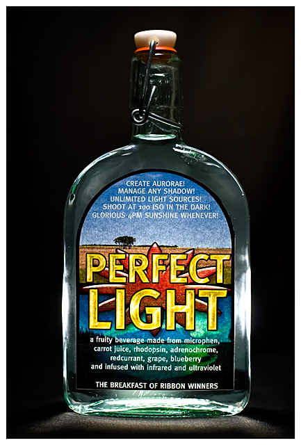
The label I printed came out really badly - it looks like noise but it isn't. Massive shame but next time I'd print it on thicker matt paper. The original design looks wicked in CS3, so much so that I might make t-shirts out of the label design :)
This is the breakfast of DPC champions - quaff some of this and all day you'll have perfect light. Well, that's the dream anyhow :) Tried to show a glass bottle of water as a bottle of light but putting a speedlite behind it (e-ttl) and a couple of LED lights. Also manual speedlite (1/64th) held above.
I think the label quality will really harm my score here. I'd like to think this could scrape a 6, but a 5.8 or similarly average will work.
PP: convert from raw, adjust levels, border, resize, noise ninja, usm, save for web.
Post Challenge: As predicted. Disappointed with the result in the context of those photos because the challenge clearly stated "that appeals to DPC users" - i.e. photography. People went out there and shot an advert for anything, not specific to DPC - which is a real shame. What's the point of making it specific if no-one adheres to it? Otherwise it would have just read "create an advertisement" without any reference to the target audience. Oh well.
Here's the label - bit oversaturated this version. Available for t-shirt making.
Statistics
Place: 54 out of 157 Avg (all users): 5.7379 Avg (commenters): 7.2941 Avg (participants): 5.6774 Avg (non-participants): 5.7581 Views since voting: 1056 Views during voting: 399 Votes: 248 Comments: 18 Favorites: 0
Wel. less is definitely more in this one. Product is prominantly displayed. This ad is the theme description's poster child and in a perfect world it would win. A little more negative space to the top or side would help if text placement was needed.





 Add photograph to your favorites
 Add photographer to your favorites


 Photographer found comment helpful.


