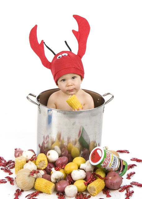
The best part of this picture is the reflection in the pot, as it helps add interset. But the background color should have been darker, as it would have made the suject pop.
Too cute... A little lobster head... Ad is interesting but could use a bit more negative space for text placement on top and perhaps a cleaner shot of the seasoning can. A couple of small adjustments and this could really be a workable ad.
Hehe, this will surely get some smiles. I expect is will do well with the DPC crowd, though I think the product is not central enough to be an advertisement. The image is about the child and not the seasoning. Good luck !






 Add photograph to your favorites
 Add photographer to your favorites


