Author Thread
Post actions
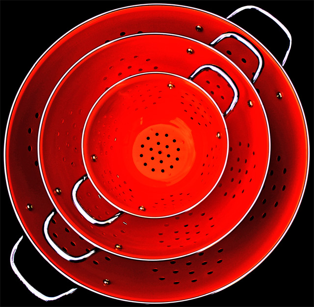
Love the comp with the square crop. Looks perfect!
Comments Made During the Challenge
Post actions
Love the use of colors. Great symmetry. Where can I buy them?
Post actions
Great sell. Wonderful use of light with the bright color and black background!
Post actions
I really like the way the color pops on this, and the diagonal the bowls are on add a lot of interest for me. I think that the contrast may need to be toned down a little though.
Post actions
wow! only 20 bucks, I want some!
Post actions
Post actions
Post actions
Nice color. I would probaby like the lighting to be such that there aren't such deep shadows in the outermost bowl.
Post actions
Post actions
Great composition and idea. Lighting is right on also. Well done.
Post actions
Very bold color! The black background was a smart choiceas was using up almost all the space in the photograph. I like the sem. too.
Post actions
Yes, well done. Simple, demonstrative, attractive. I'd buy it.
Post actions
The BEST by far.......... 10
Post actions
Looks like it's available in red.
Post actions
Very effective. I like ads like this. Less is more. Your title fits this concept too. A little negative space to the top or bottom (or side) would allow text to flow easier into the ad.
Post actions
Not really an advertisement looking shot, but i like it in terms of composition.
Post actions
Post actions
Post actions
Very nice. The black backround really makes the object stand out.
Post actions
Post actions







 Add photograph to your favorites
 Add photographer to your favorites

 Photographer found comment helpful.


