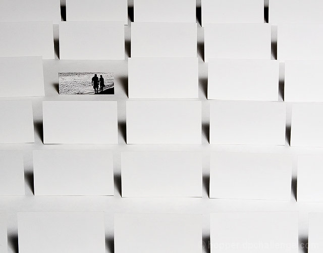
What kind of business would use a picture like that ... never mind; I don't want to know. Interesting idea but I don't think I would want a card that was significantly smaller than what other people hand out, even if it did have a pretty picture on it. Your composition is nicely done and I like the lighting and shadows, though.
Interesting idea but it doesn't work for me. The white cards are a little too overexposed for my taste and made it hard to identify what they are when first looking at the photo. Also it bothers me that the card with the couple is smaller than the white cards.
An excellent photograph. Lighting is perfect, and nice job not blowing out the whites.
The only thing that I find distracting about this photo is that the business card being advertised is so much smaller than the other cards. This doesn't make it stand out as much as it should.
There are so many possibilities for this but as it sits, I'd never guess the product without the title. However, My creative team would have a blast adding text and photos to the blank cards to create something very special. You're definitely on the right track here. Good work.
Great set up! I think it would be better if you had put the card in color, especially for the ocean. Or, make it all in color but brighter for your own card. I rember 7-up & other products doing that very successfully.





 Add photograph to your favorites
 Add photographer to your favorites


 Photographer found comment helpful.


